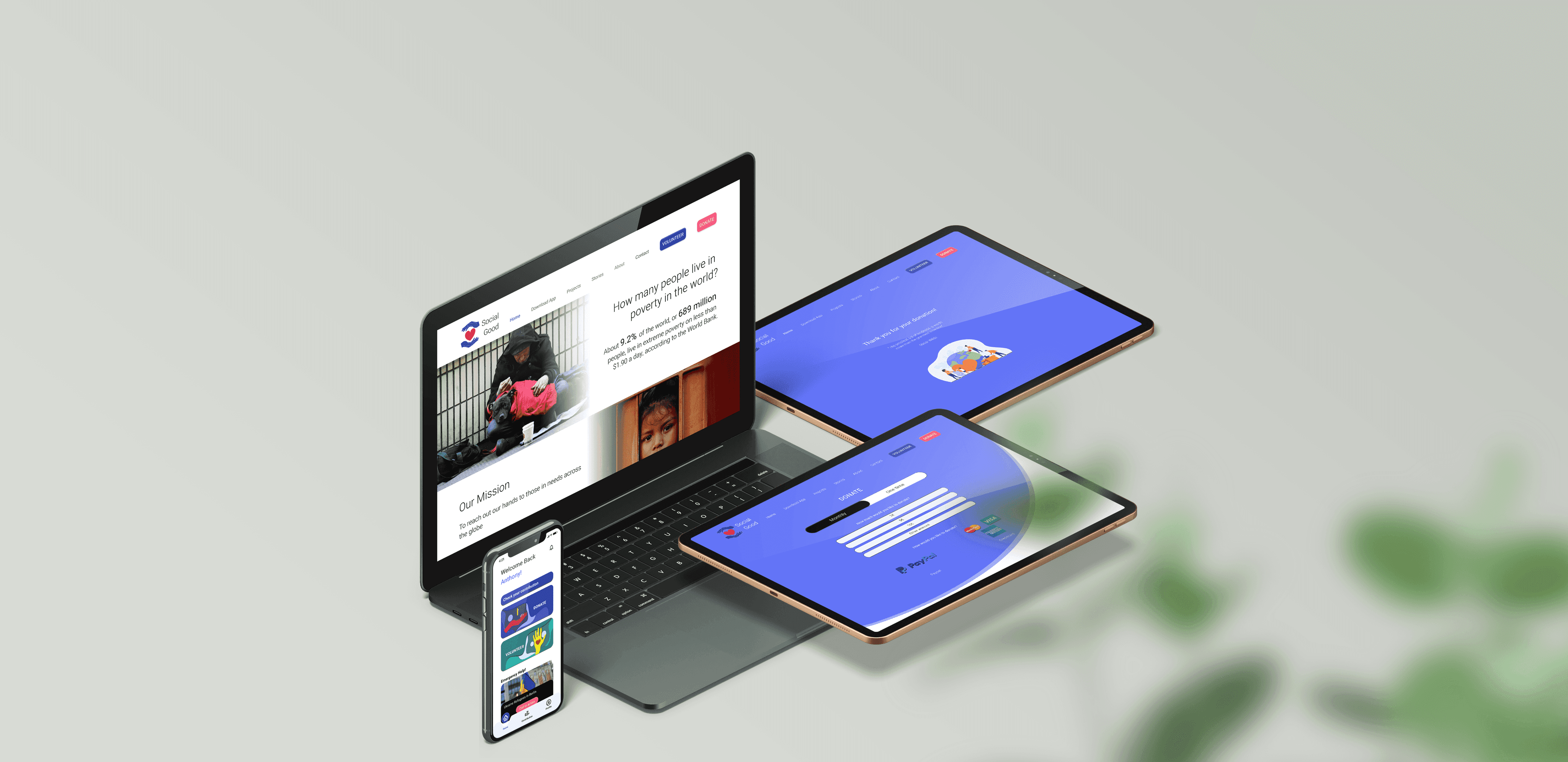
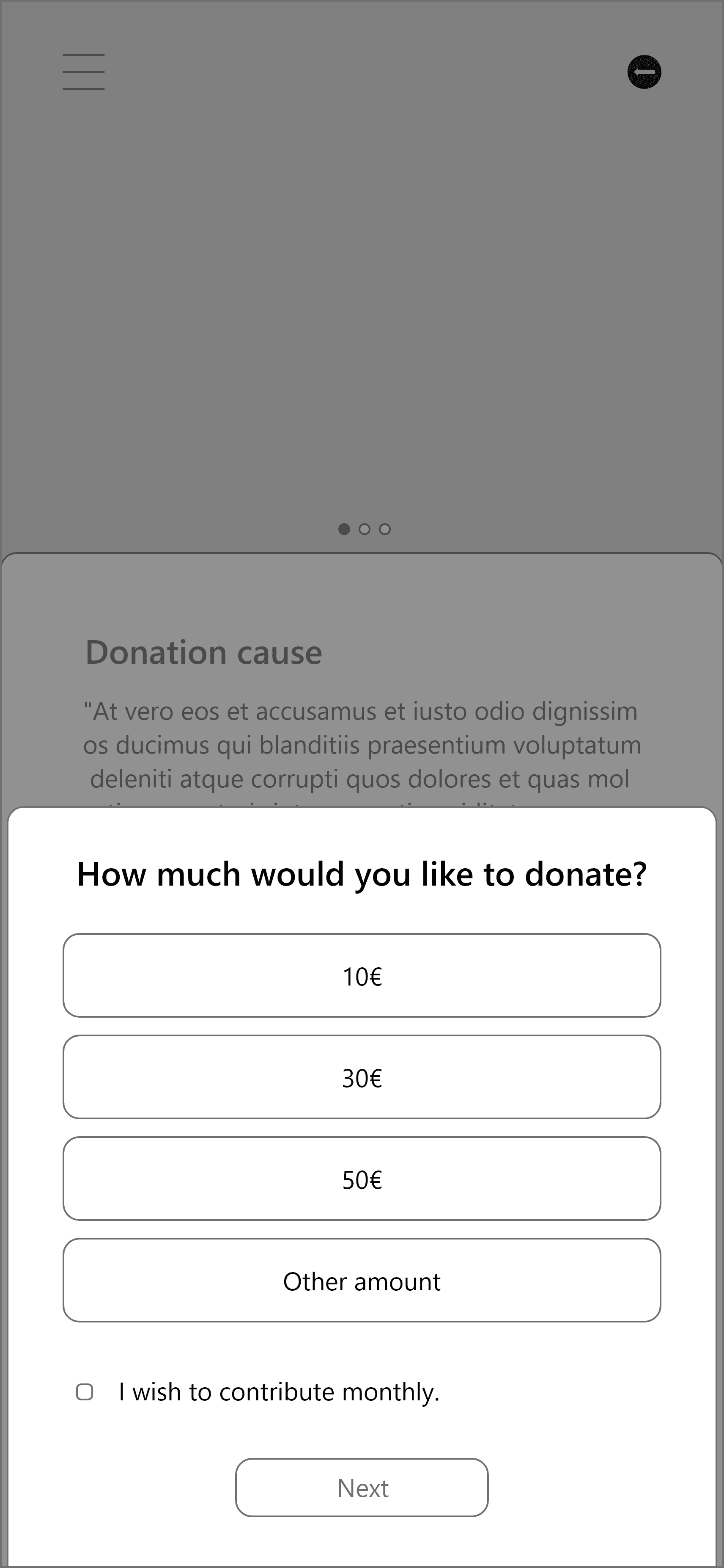
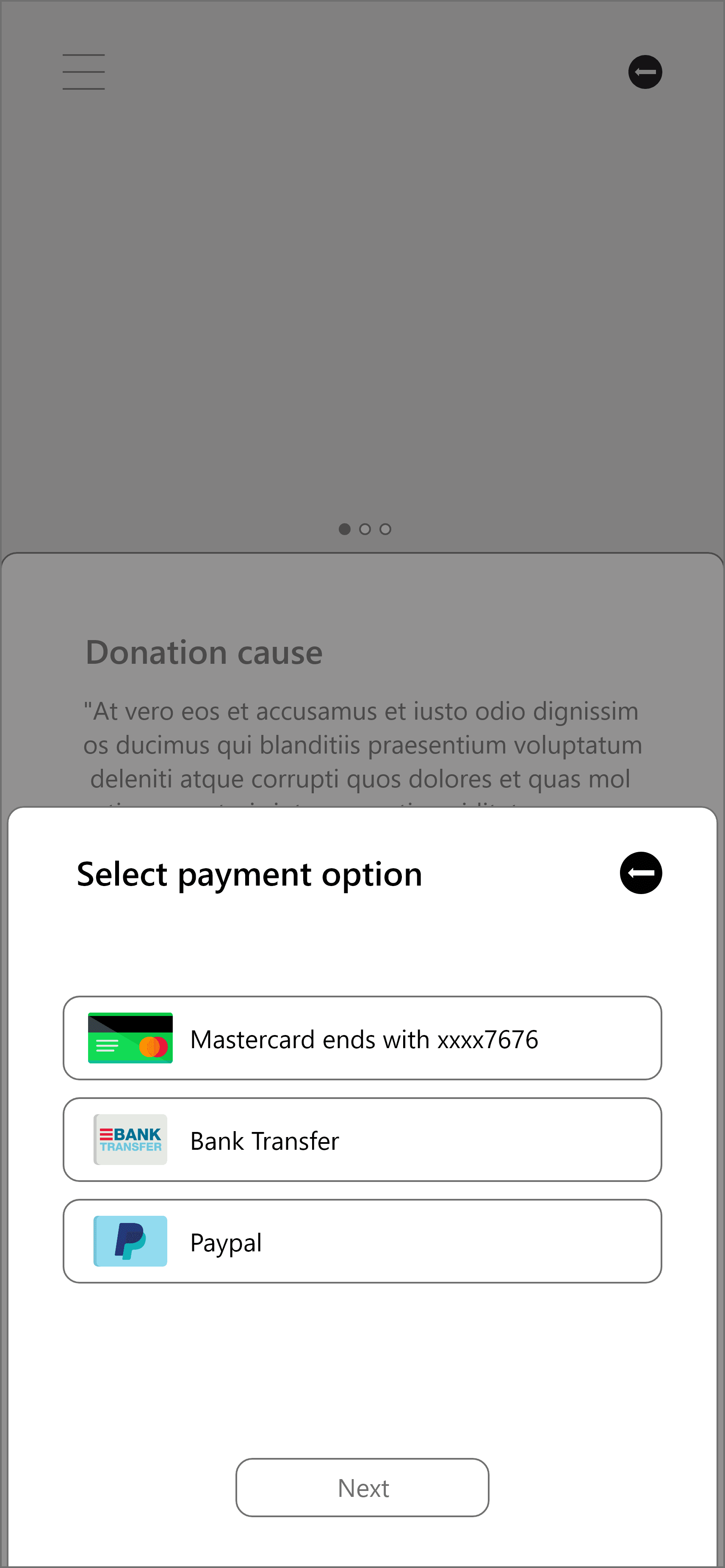
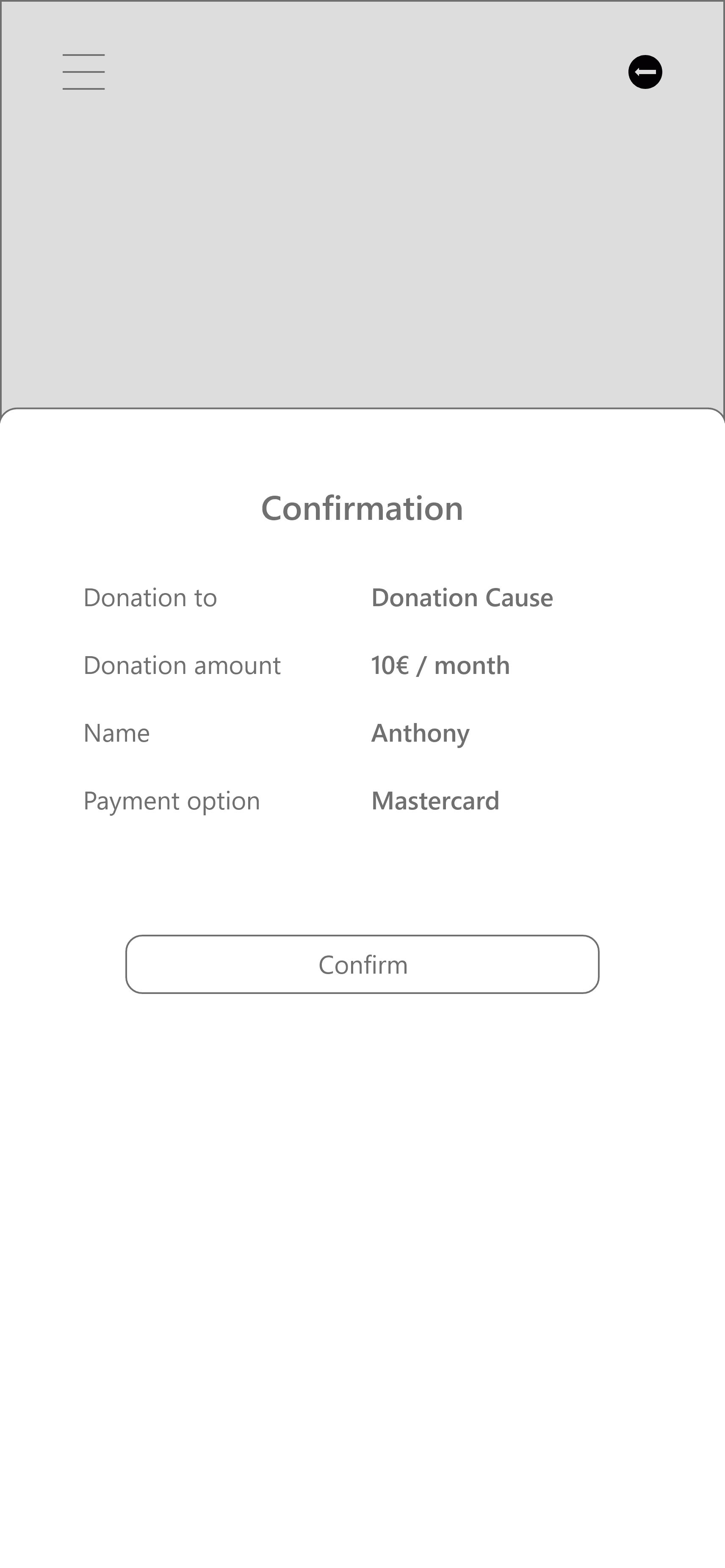
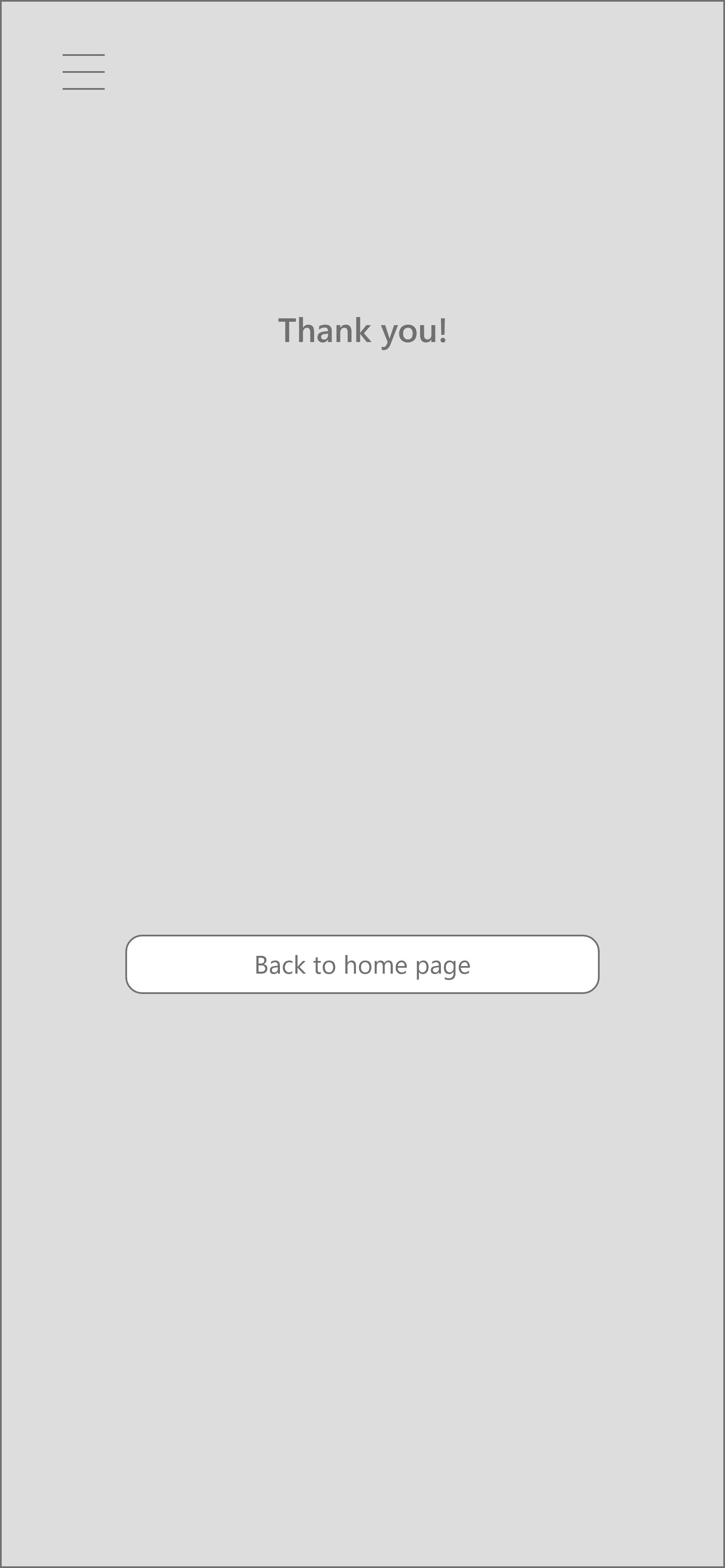
Disclaimer: This is a fictional project under the Google UX Design Certificate course.
Social Good is a fictional non-profit organization that aims to help those affected by poverty.
The goal of this project is to design an efficient user experience for users who wish to contribute to alleviating poverty worldwide through Social Good.
Research
User Interview
I surveyed my surrounding people, to figure out who are the potential users and what kind of problems they face when they want to donate money.
Participants
2 students,
1 professional
Setting
Informal, remote
5 Questions
15 ~ 20 minutes
Findings
★
Potential users are busy individuals with limited time
★
Most of their donations are casual small cash donations to the people in need, who they met on their way
★
Majority is not fully aware of the current events in the world and how they can help
★
One was sceptic about where the donations are spent
Defining Problem
Persona
To better understand the target audience, I created a user persona based on the research; meet Cici.
Cici
Knowing that I can help, makes me happy
Goals
Helping out those in need in her possible means
Frustrations
Clueless about how she can help
Doesn’t have much resources in her hand
Cici's user journey
And I followed it up with a user journey to further refine and clarify the design challenge.
Solution Ideation
Social Good’s competitors
A competitive analysis of other non-profit organizations, that are actively working on poverty alleviation, was conducted to gain awareness of what is already existing out there.
Crazy eights
Crazy eights was used to generate ideas and solutions rapidly.
Crazy eights
Prototype
Userflow & paper wireframes
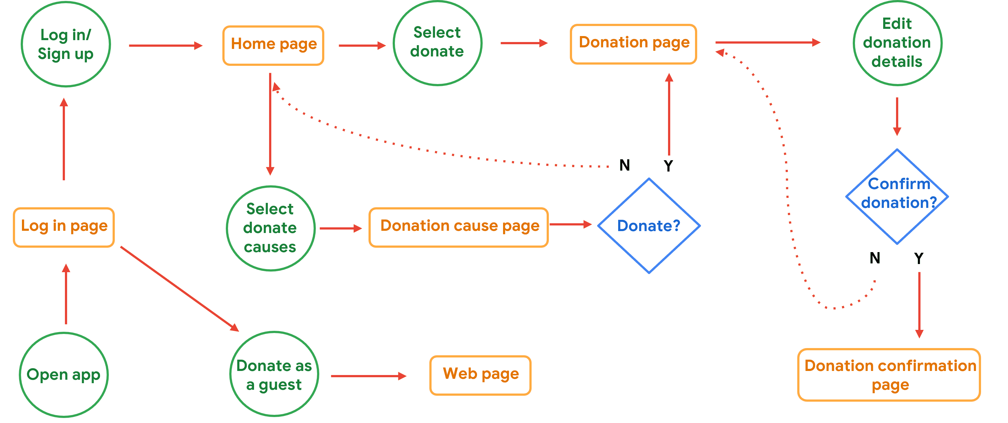
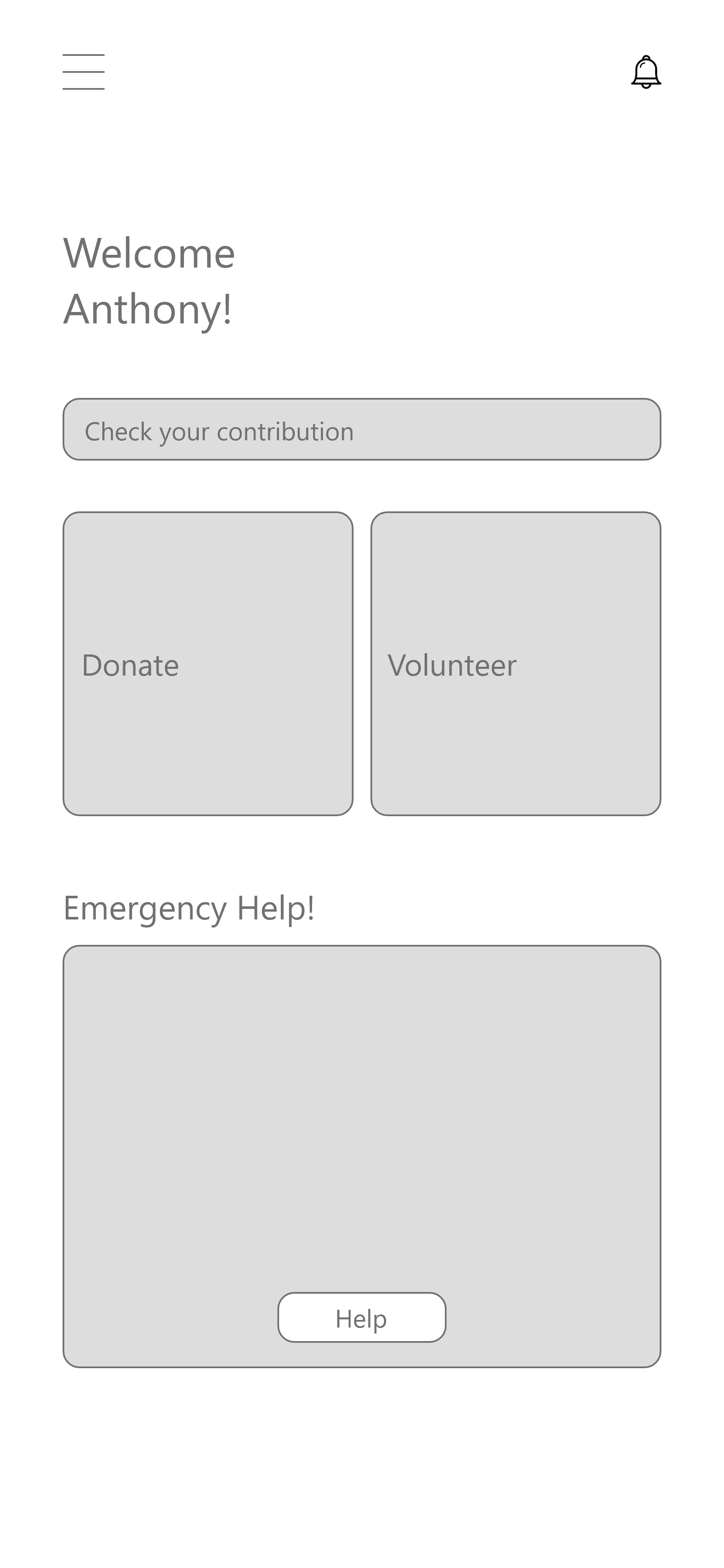
Userflow was used to have a better visual representation of the key feature of the app and the path the user takes to complete the donation process using the mobile app.
Userflow
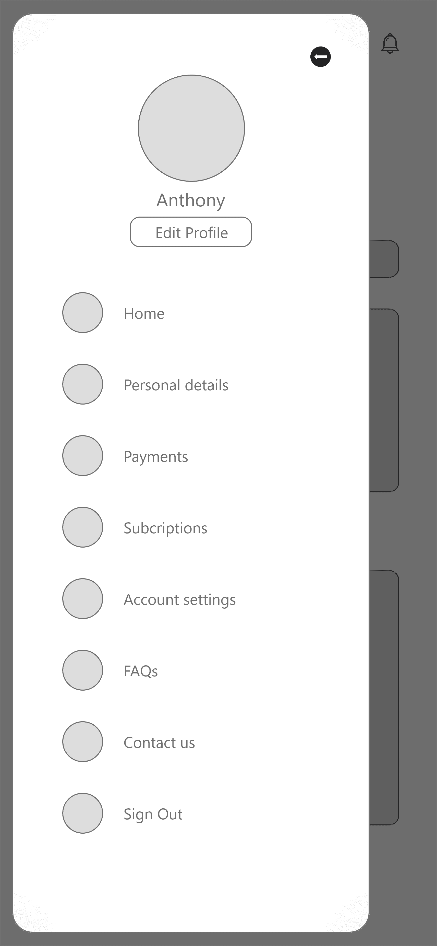
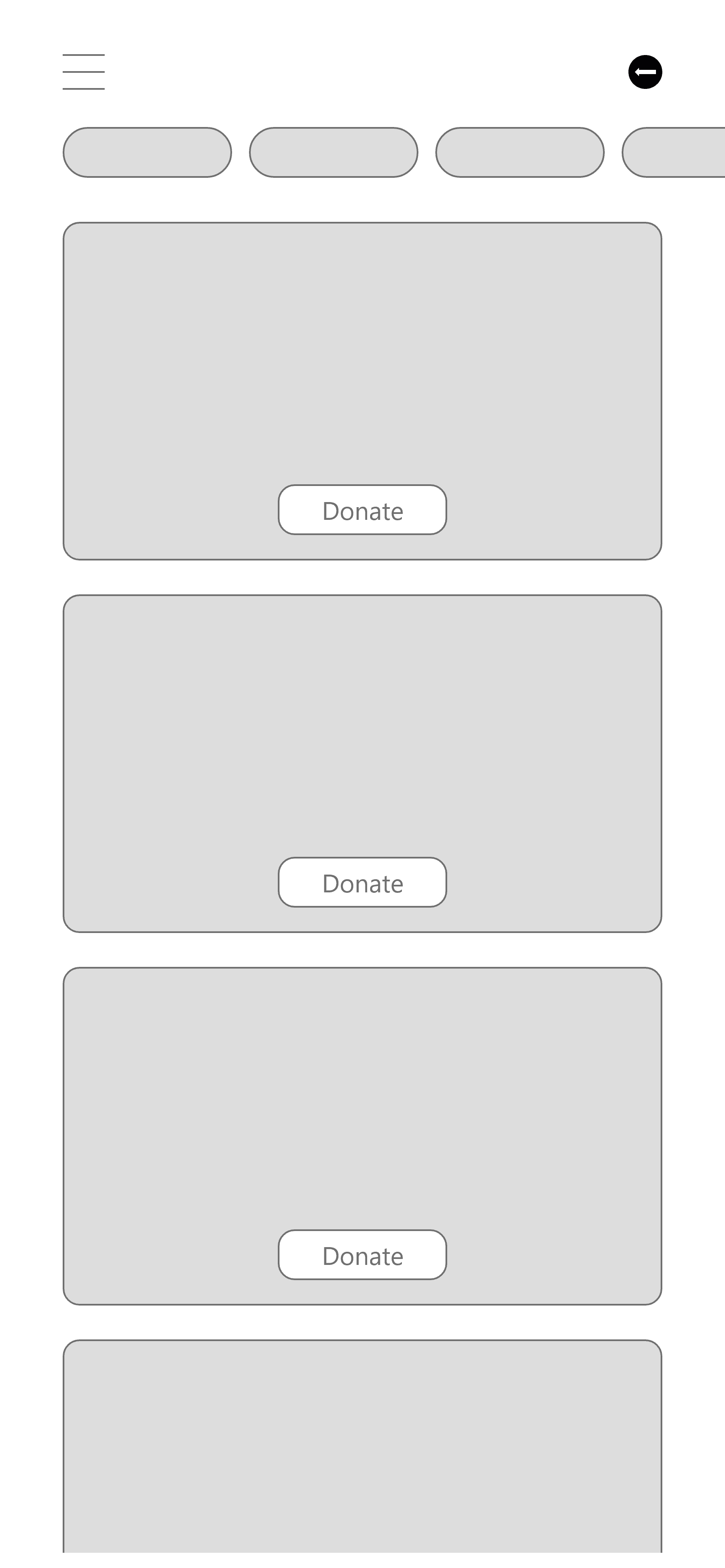
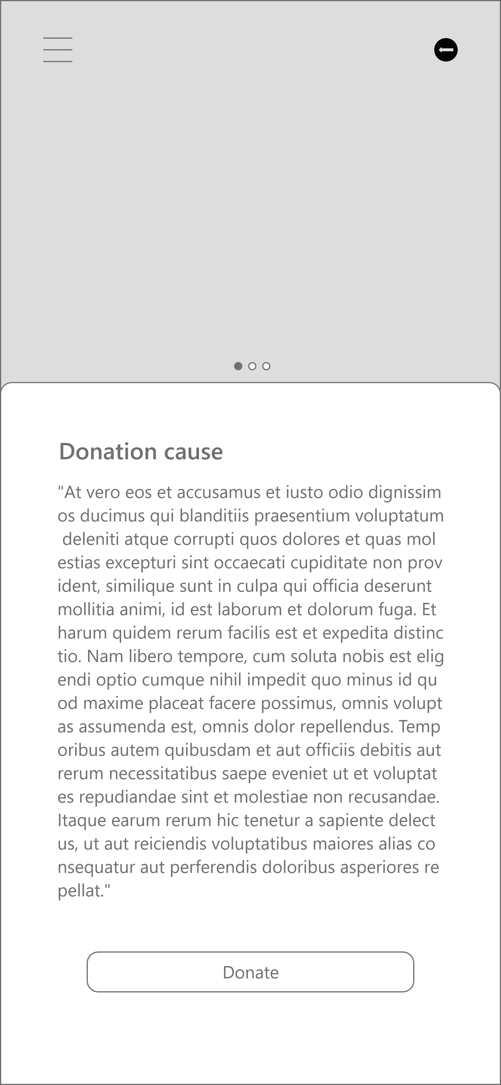
Paper wireframe sketch
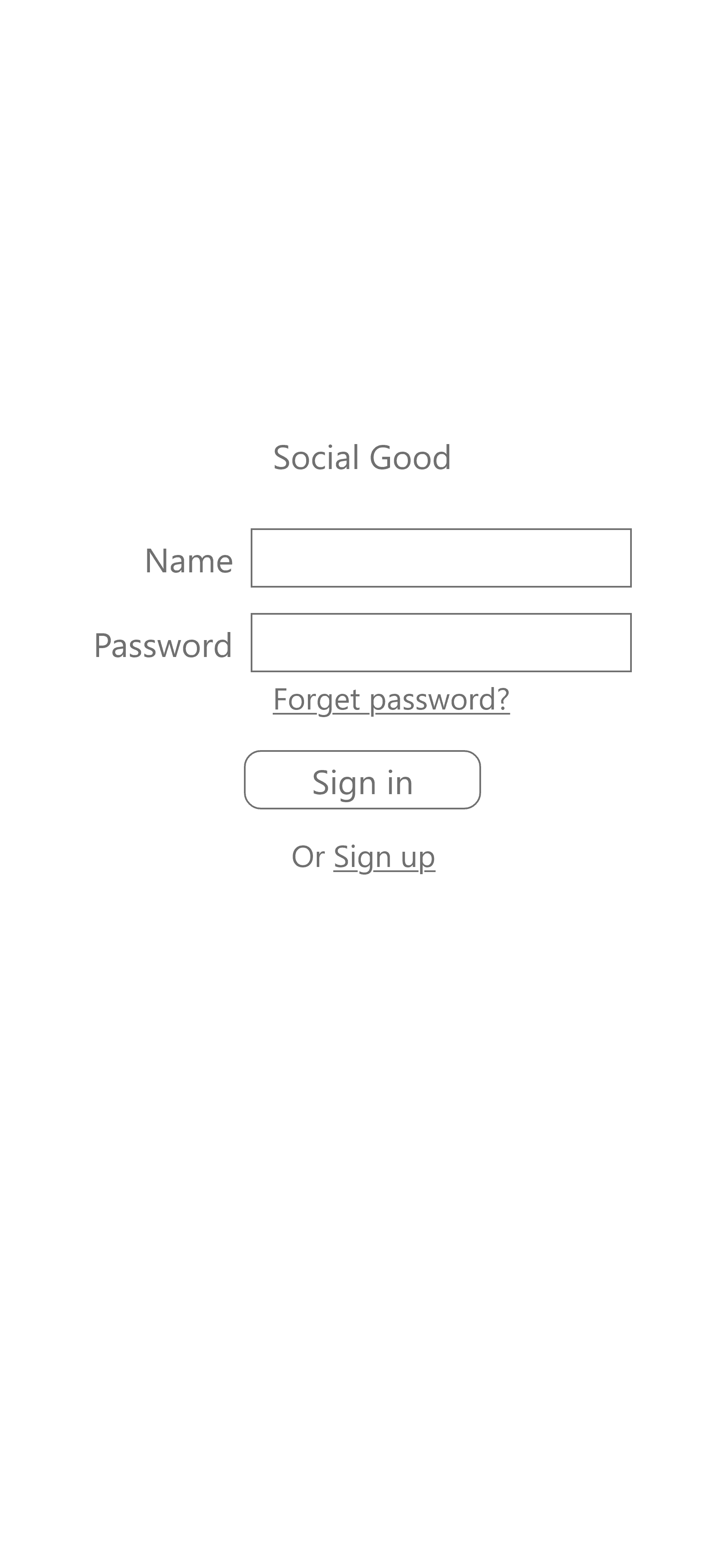
Low-fidelity prototype
Usability test
Usability test was conducted using the low-fidelity prototype. The goal was to test whether the users can complete the core task and to determine if the app is easy to navigate, before committing and proceeding to a high-fidelity prototype.
Participants
3 Students,
2 Professionals
Setting
Informal, remote
Time on task, SUS, Drop-off rate
10 ~ 20 minutes
Test flow
1
Explore the app
2
Complete a donation
3
Follow-up questions and SUS
Define & Ideate
Affinity diagram
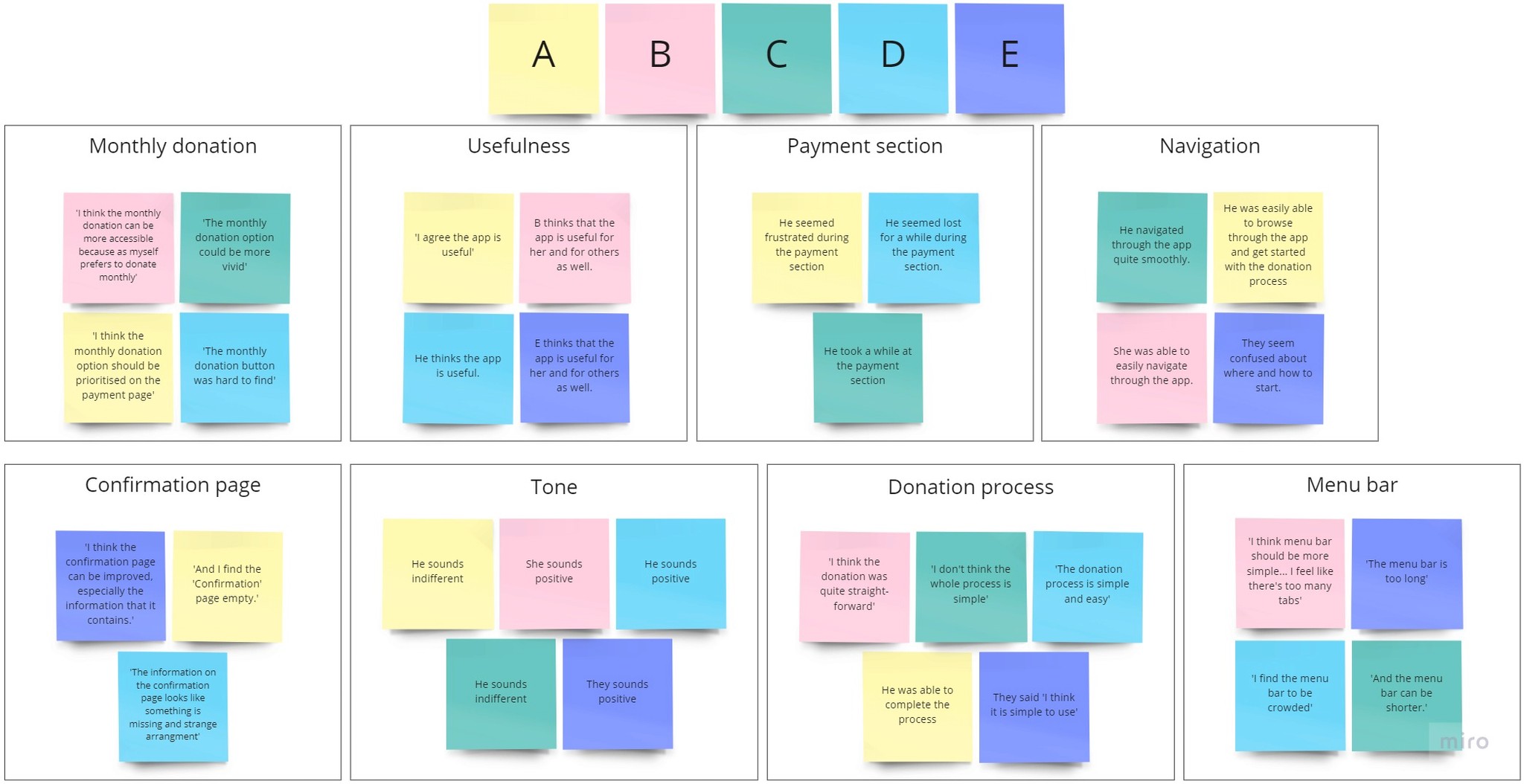
Affinity diagram was used to organize the test findings and to identify common patterns among them.
Affinity diagram
Prioritised insights
Insights were then generated based on the patterns identified and were narrowed down to the top three.
Insights
★
Users need a ‘confirmation’ page with a more familiar format
★
Users need a simpler and less crowded menu bar
★
Users need more straight-forward access to donate monthly
Prototype
Insight implementations
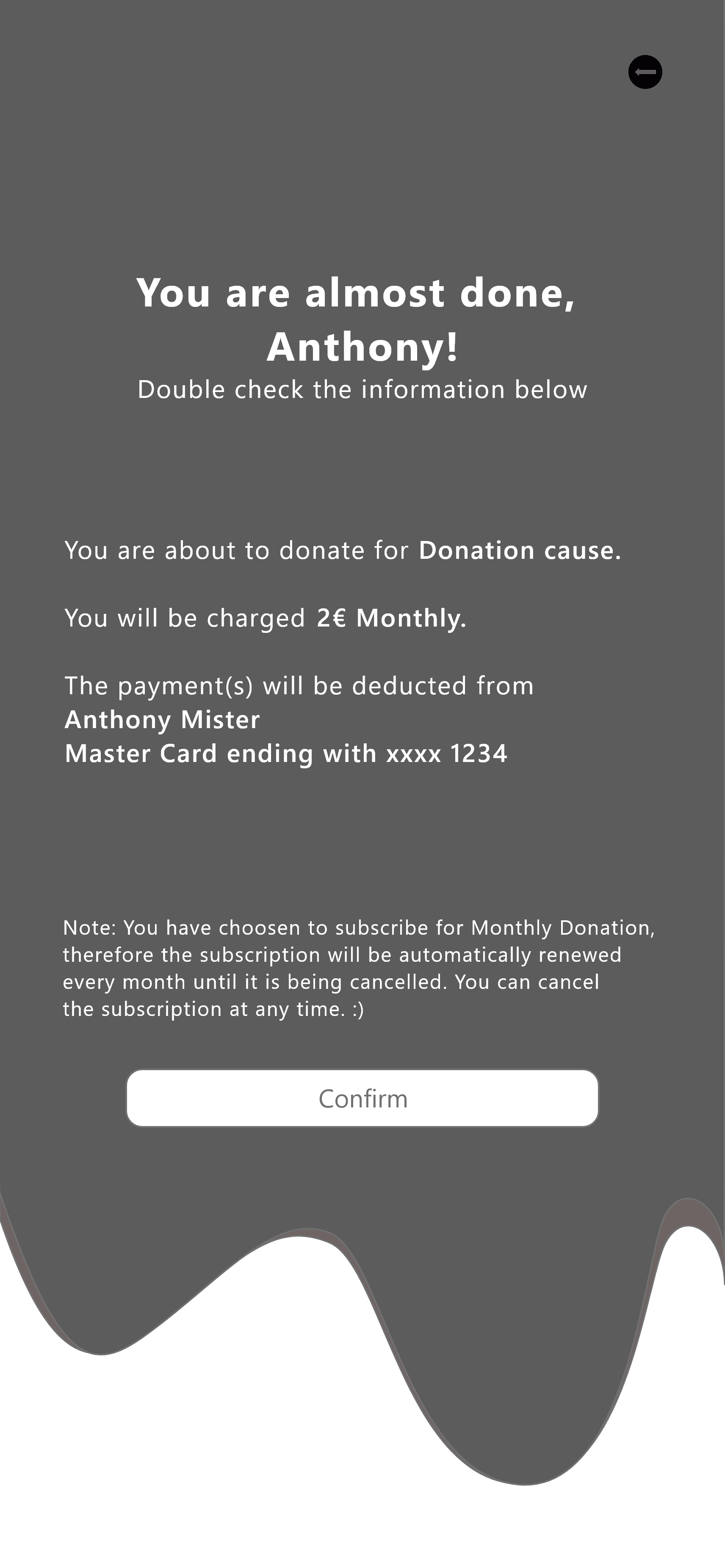
Insight 1: most users feel that the information on the ‘Confirmation’ page is unnatural, the insight is that users need a ‘Confirmation’ page with a more familiar format.
Insight 2: the majority of users feel that the menu bar is crowded, an insight is that users need a more simplified menu bar.
In the improved design, the progressive disclosure method is used to have a neater interface by showing only the prioritised items in the menu bar.
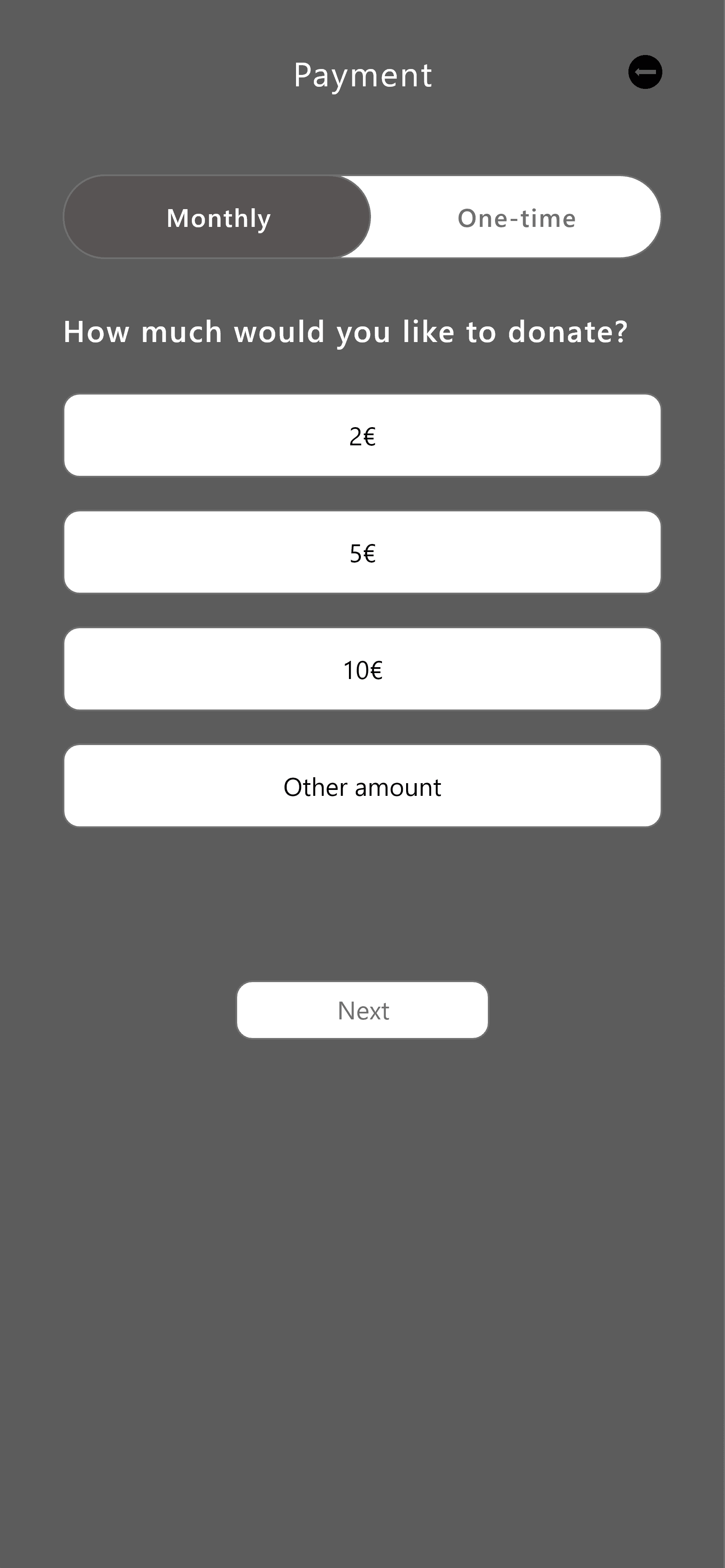
Insight 3: the majority of users prefer to donate monthly, the insight is that users need more straightforward access to donate monthly.
The monthly donation is set as default with a more transparent switch.
High-fidelity prototype


Design system
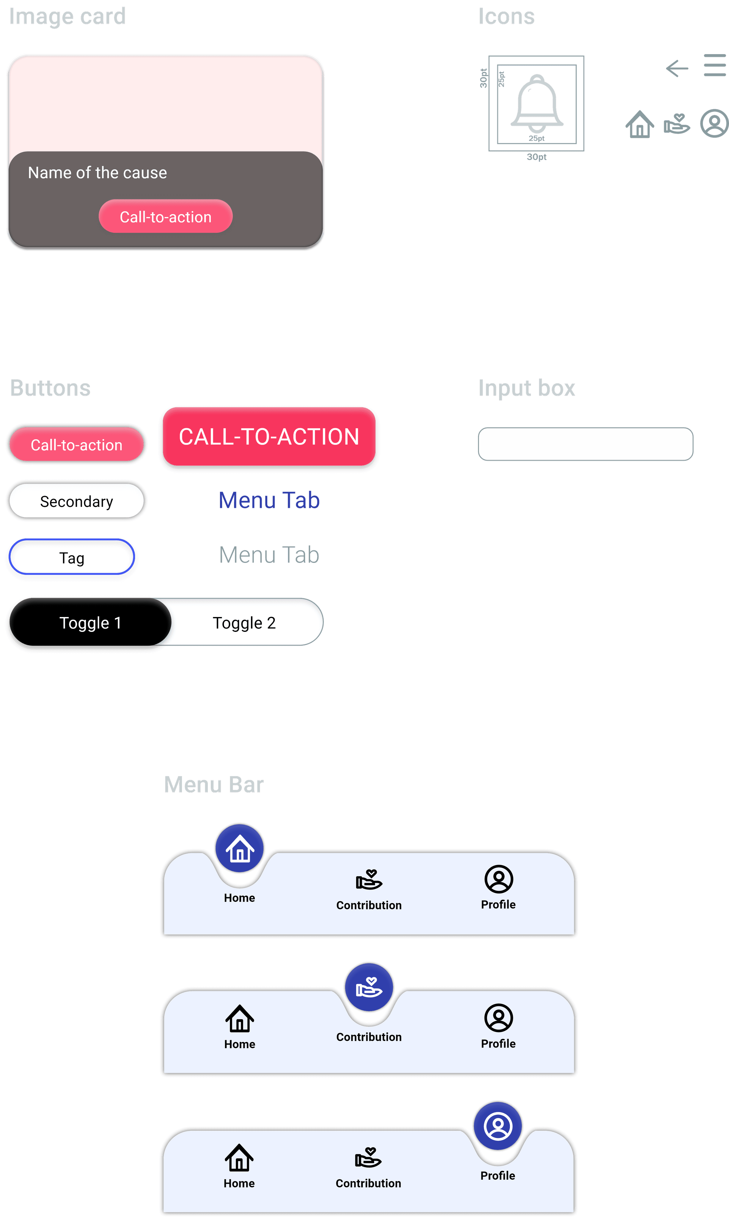
Before moving on to designing the responsive website, I consolidated a design system based on the UI used in the mobile app. As it helps create consistent and efficient product design which improves the user experience. It also helps to streamline the design and development process.
Color palette
Logo

Typography
Roboto
Aa Bb Cc Dd Ee Ff Gg Hh Ii Jj Kk Ll Mm Nn Oo Pp Qq Rr Ss Tt Uu Vv Ww Xx Yy Zz
Components
Responsive site
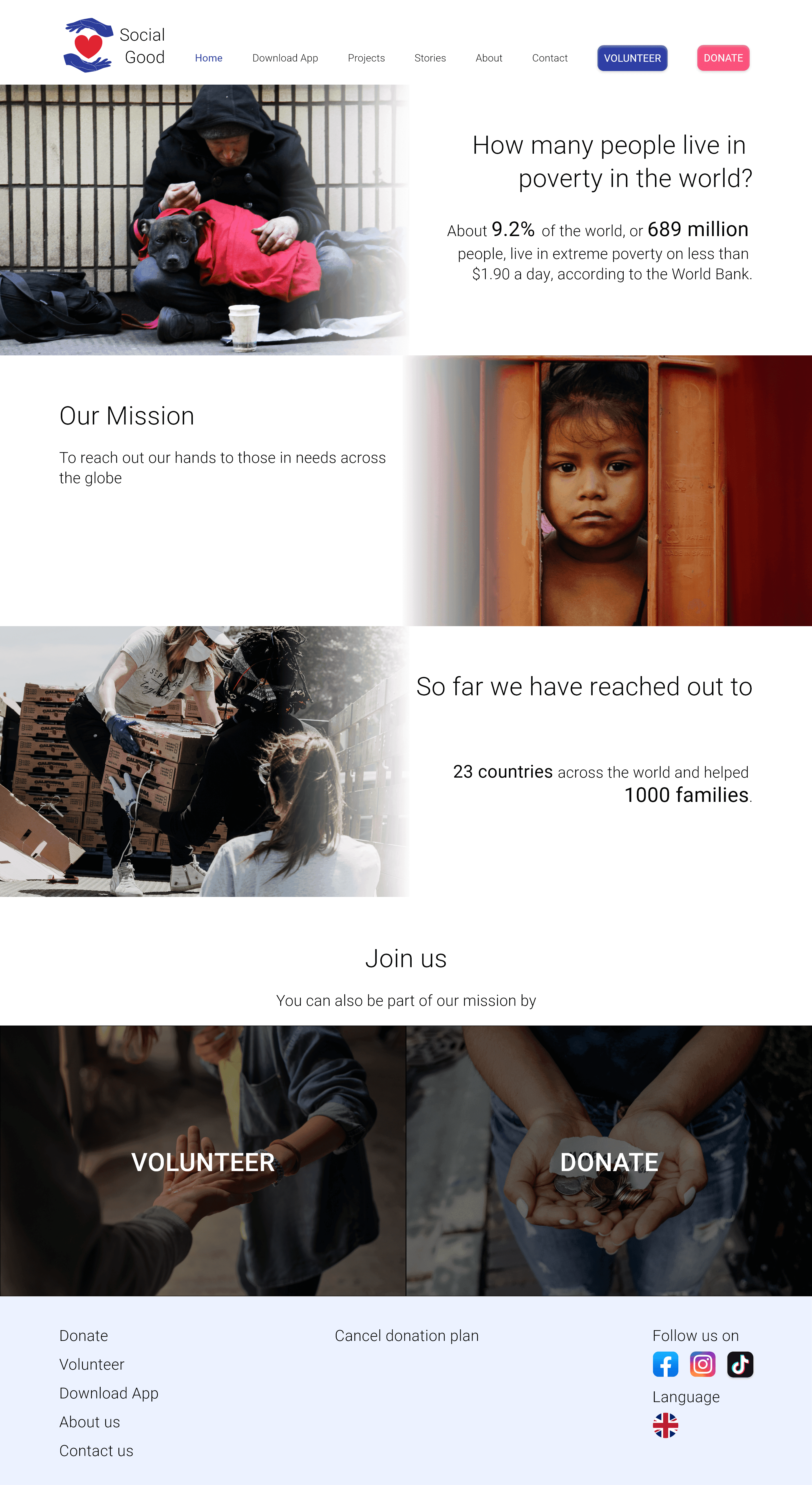
The responsive website was designed while having in mind that the website will be used as a general informational site and landing page for new users and a donation site for one-time donators.
Desktop
Mobile
Reflection
During this project, I discovered my preference for the type of projects I would like to work on in the future. And also the systematic way of designing, as this project required me to review back everything I have learned from the certification course.
